

Exploring the Aesthetic Potential of Paper Packaging
Paper has always been more than a surface to print on. It is a material with its own character—grain, weight, texture, warmth. In the hands of a skilled designer and a capable manufacturer, paper becomes something far more expressive than a simple container. It becomes a canvas for light, shadow, touch, and emotion.
For decades, the packaging industry treated paper as a substrate—a neutral base for graphics. The aesthetic value came from what was printed on top. Today, that thinking has been turned on its head. Designers are increasingly treating the paper itself as the design, using its natural qualities as the foundation for a richer, more layered visual and tactile experience. The finishes applied to the surface, the techniques used to shape it, and the contrasts created between different areas of the package all contribute to how a customer perceives—and remembers—a brand.
This guide explores the aesthetic potential of paper packaging. From the fundamentals of surface finishes to the decorative techniques that create visual impact, we examine how paper can be transformed into an object of desire rather than a mere container.
- Paper Packaging Surface Finishes – Enhancing Visual and Tactile Appeal
- Decorative Finishing Techniques: Creating Visual Impact
- Hot Stamping: Adding a Refined Metallic Touch
- Spot UV and Reverse Matte: Creating Striking Light-and-Shadow Effects
- Embossing and Die-Cutting: Adding Texture and Character to Packaging
- Conclusion
Paper Packaging Surface Finishes – Enhancing Visual and Tactile Appeal
The finish applied to paper packaging determines not only how it looks but how it feels. It is the first thing a customer notices when they pick up a box, and it shapes their perception before they have read a single word.
Matte finishes have become the defining aesthetic of contemporary premium packaging. A matte surface diffuses light rather than reflecting it, creating a soft, non-reflective appearance that feels calm, restrained, and sophisticated. Matte finishes also have a tactile quality—often described as velvety or suede-like—that invites touch. They reduce glare, make text easier to read, and allow the natural texture of the paper to show through. For brands seeking understated elegance, matte is often the finish of choice.
Gloss finishes offer the opposite effect. They create a shiny, reflective surface that makes colours appear more vibrant and saturated. Gloss finishes are excellent for high-impact graphics, photography, and designs that need to catch the eye from a distance. However, they can produce glare under direct lighting and tend to show fingerprints more readily than matte surfaces.
Satin and silk finishes occupy the middle ground. They offer a subtle sheen—softer than gloss, more luminous than matte—that creates a refined, polished appearance without the drawbacks of either extreme. Satin finishes are versatile and work well across a wide range of product categories.
Beyond these core options, specialty finishes add further dimensions. Soft-touch coatings create a rubberized, warm feel. Textured varnishes mimic materials such as linen, leather, or stone. Metallic and pearlescent coatings introduce subtle shimmer. Each finish communicates something different about the brand, and each interacts differently with light, colour, and the paper's own texture.
The key insight is that finishes are not merely protective layers. They are design decisions that shape perception. A finish that feels luxurious can make a product seem more valuable. A finish that feels natural can reinforce a brand's sustainability credentials. A finish that feels smooth and precise can signal technological sophistication. Choosing the right finish is therefore not a technical afterthought—it is a strategic choice.
Decorative Finishing Techniques: Creating Visual Impact
While surface finishes establish the overall character of the packaging, decorative finishing techniques create moments of visual and tactile interest. These techniques allow designers to draw attention to specific elements, create contrast, and add layers of meaning to the design.
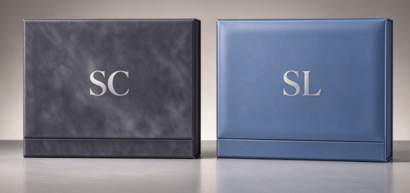
Foil stamping is one of the most recognisable decorative techniques. It involves applying a thin metallic or pigmented foil to the paper surface using heat and pressure. The foil adheres to the paper where the die presses it, creating a crisp, reflective element that catches light and draws the eye. Gold, silver, copper, rose gold, and holographic foils are all commonly used, each conveying a different mood. Foil stamping is often used for logos, brand names, and decorative borders, and it works particularly well against matte or textured backgrounds where the contrast is most striking.
Embossing and debossing create three-dimensional effects by raising or recessing areas of the paper surface. Embossing presses the paper upward, creating a raised image or pattern. Debossing presses it inward, creating a recessed area. Both techniques add tactile depth and visual interest, and both can be used with or without ink or foil. Blind embossing—creating a raised effect without any colour—is particularly elegant on textured papers, where the play of light across the raised surface becomes part of the design.
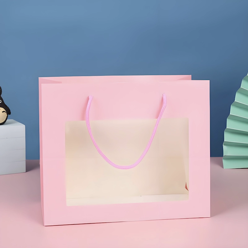
Die-cutting transforms the shape of the packaging itself. Rather than simply cutting a rectangle, die-cutting can create windows, custom silhouettes, intricate patterns, and functional features such as tabs, slots, and handles. A die-cut window can reveal the product inside. A die-cut pattern can create a lace-like effect that casts shadows when light passes through. A die-cut silhouette can turn a simple box into a recognisable shape that reinforces brand identity.
Spot UV and reverse matte techniques create striking light-and-shadow effects. Spot UV applies a glossy coating to selected areas of a matte or uncoated surface, creating a high-contrast highlight that draws attention to the treated areas. Reverse matte achieves the opposite: a matte coating applied over a gloss surface, leaving selected areas glossy and the rest matte. Both techniques create a visual and tactile interplay that adds depth and sophistication.
Lamination—whether gloss, matte, or soft-touch—provides both protection and aesthetic enhancement. It seals the surface against moisture, scuffing, and handling, while also creating a distinct tactile experience. Soft-touch lamination, in particular, has become a hallmark of premium packaging, offering a velvety surface that feels as luxurious as it looks.
These techniques can be combined in countless ways. A box might feature a matte finish with a spot UV logo, foil-stamped text, and a die-cut window. Another might use embossing on a soft-touch surface with no ink at all, allowing the texture and shadow to carry the design. The possibilities are limited only by the designer's imagination and the manufacturer's capabilities.
Hot Stamping: Adding a Refined Metallic Touch
Hot stamping, also known as hot foil stamping, deserves particular attention because of its enduring appeal and versatility. It is one of the oldest decorative techniques in printing, yet it remains one of the most effective.
The process is straightforward in principle. A heated die is pressed against a foil carrier film, which transfers a thin layer of metallic or pigmented material onto the paper surface. The die is custom-made for each design, allowing for precise, repeatable results across large production runs.
What makes hot stamping so effective is its ability to create instant visual hierarchy. A gold-foiled logo on a matte black box immediately draws the eye. The metallic surface reflects light in a way that flat printing cannot replicate, creating a sense of depth and dimension. It signals luxury, celebration, and quality.
Hot stamping is also remarkably versatile. It can be applied to almost any paper or board surface, including coated, uncoated, textured, and recycled stocks. It can be combined with embossing to create a raised, metallic effect that is both visually and tactilely striking. It can be used sparingly—a single foil line or a small logo—or generously, covering large areas of the design.
The choice of foil colour and finish also matters. Bright gold conveys tradition and opulence. Silver suggests modernity and precision. Rose gold offers warmth and femininity. Holographic foils create rainbow effects that shift with the viewing angle. Matte foils provide a more subdued metallic look. Each option communicates something different about the brand.
For brands seeking to add a refined metallic touch that elevates their packaging, hot stamping remains one of the most reliable and impactful techniques available.
Spot UV and Reverse Matte: Creating Striking Light-and-Shadow Effects
Among the most visually arresting techniques in paper packaging are spot UV and reverse matte. Both rely on the contrast between glossy and matte surfaces to create dynamic light-and-shadow effects that change as the viewer moves around the package.
Spot UV involves applying a high-gloss UV-cured coating to selected areas of a printed surface. The rest of the surface remains matte or uncoated. When light hits the package, the glossy areas reflect it brightly while the surrounding matte areas absorb it. The result is a striking contrast that draws attention to the treated elements—typically a logo, a product name, or a decorative pattern.
Spot UV is particularly effective on dark backgrounds, where the glossy highlights stand out most dramatically. It can be applied in varying thicknesses to create subtle or pronounced effects. It can also be combined with embossing to create a raised, glossy element that is both visible and tactile.
Reverse matte achieves a similar effect through opposite means. A gloss surface is coated with a matte varnish, leaving selected areas glossy. The result is the same interplay of light and shadow, but with the matte areas dominating and the glossy areas providing the highlights.
Both techniques add a layer of visual and tactile sophistication that flat printing cannot achieve. They create depth, invite touch, and reward close inspection. They also allow designers to guide the viewer's eye through the design, drawing attention to the most important elements while allowing secondary information to recede.
The key to using spot UV and reverse matte effectively is restraint. Too many glossy highlights scattered across a surface can look cluttered and lose their impact. The most effective designs use these techniques selectively—a single logo, a key graphic, or a carefully placed pattern—to create a focal point that draws the eye and anchors the design.
Embossing and Die-Cutting: Adding Texture and Character to Packaging
Texture is one of the most powerful tools in packaging design. It engages the sense of touch, creating a physical connection between the customer and the brand. Embossing and die-cutting are two of the most effective ways to add texture and character to paper packaging.
Embossing creates a raised surface on the paper by pressing it between a male and female die. The paper is stretched and shaped, creating a three-dimensional effect that can be subtle or pronounced. Embossing can be used to highlight a logo, create a pattern, or add a tactile element to an otherwise flat design. When combined with foil stamping, embossing creates a raised metallic element that is both visible and tactile. When used alone on textured paper, it creates a subtle, sophisticated effect that rewards touch.
Debossing is the opposite of embossing—it presses the paper inward, creating a recessed area. Debossing is often used for logos and text, creating a subtle indentation that feels precise and considered. Like embossing, it can be combined with foil or ink for additional impact.
Die-cutting adds character through shape. A die-cut window reveals the product inside, creating anticipation and transparency. A die-cut pattern creates intricate shapes that cast shadows and add visual interest. A die-cut silhouette transforms the packaging into a recognisable form—a bottle shape, a leaf, a geometric form—that reinforces brand identity and makes the packaging memorable.
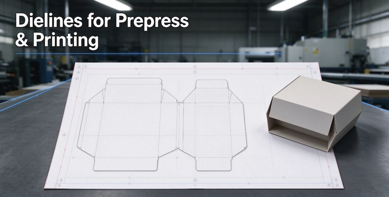
Die-cutting can also be functional. Tabs, slots, handles, and locking mechanisms can all be created with precision dies, allowing the packaging to be assembled without glue or tape. These features add convenience for the customer and reduce the need for additional materials.
The combination of embossing and die-cutting creates packaging that is rich in texture, character, and functionality. A box might feature a debossed logo on a matte surface, with a die-cut window revealing the product, and a die-cut handle for easy carrying. Each element adds a layer of interest that makes the packaging more engaging and more memorable.
Conclusion
The aesthetic potential of paper packaging is vast and still largely untapped. Beyond the graphics that are printed on it, the paper itself—its texture, its weight, its response to light and touch—is a design material in its own right.
Surface finishes shape the overall character of the packaging, determining whether it feels luxurious, natural, modern, or traditional. Decorative techniques such as hot stamping, spot UV, reverse matte, embossing, and die-cutting add layers of visual and tactile interest that reward close inspection and create lasting impressions.
The most successful packaging designs treat these techniques not as add-ons but as integral parts of the design. They use contrast, restraint, and intention to create packaging that is not just seen but experienced. In doing so, they elevate the product, strengthen the brand, and create moments of connection that customers remember.
Paper, in other words, is not just a surface. It is a medium of expression. And the brands that understand this are the ones whose packaging truly stands out.
About Us
Can you do the design for us?
Yes. We can offer free design the artwork according to your requirement.
About Printing Craftsmanship
How do I ensure high-quality printing results?
Use high-resolution images and vector files.
Choose the appropriate paper or substrate.
Work with a professional printing service.
Consider color matching systems like Pantone for consistent results.
Request print samples before full production.
What is embossing, and how is it different from debossing?
Embossing is a technique that creates a raised impression on a material, while debossing presses the design inward, creating a recessed effect. Both techniques add texture and sophistication to printed materials.
Rigid Magetic Boxes
What are the wholesale pricing options for bulk orders?
We offer competitive wholesale prices for bulk orders. Please contact our sales team for more details
OEM Services
What is OEM packaging, and how can Winpack Printing help?
OEM (Original Equipment Manufacturer) packaging refers to custom-designed packaging solutions tailored to a brand’s specifications. At Winpack Printing, we provide end-to-end OEM services, including design, proofing, printing, and production, to help you create high-quality, market-ready packaging that aligns with your brand identity.

Start Your Packaging Journey Today
Discover Our Curated Collection of Bespoke Packaging Cases & Tailored System Solutions
© 2025 WINPACK PRINTING. All rights reserved

Winpack Printing
https://www.facebook.com/alexwenhua123?mibextid=ZbWKwL
https://www.instagram.com/wenhua_printpackaging/