Tips to Create the Right Packaging Logo (With Examples)
Have you ever received a package from your favourite shop? When you see the logo on the box, you get excited and can't wait to open it. So why not give your customers the same feeling?
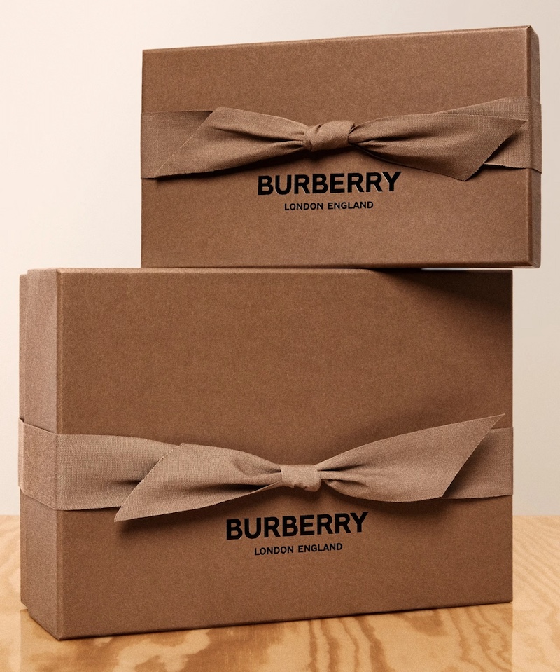
If you don't pay much attention to your logo and packaging design, it's time to change them. An empty box with minimal or no signage looks suspicious and is unclear. Alternatively, putting your logo on the package will:
Make you more recognisable and enhance brand awareness.
It will also help you to stick to brand consistency and represent who you are correctly.
It will inform your customers of what to expect and enhance consumer confidence.
Designing a logo for your packaging is a good idea, and in this case, we would like to help you utilise this strength to your advantage. Below, you will find some creative ideas on how to design the perfect packaging logo. You will also see examples of excellent packaging from the best brands. Let's get started!
- Here are some things to consider when designing your logo for a package
- The right colours to use in your packaging logo
- Logo Design Tips in Packaging Typography
- Adding imagery to logo graphic packaging
- Ensuring scalability and versatility in a packaging logo
- Striking a balance between simplicity and complexity in a logo graphic for use on packaging
- Testing and testing your packaging logo
- Create an award-winning packaging logo!
Here are some things to consider when designing your logo for a package
Before we get started, we are going to take a look at some tasty tips on how to come up with an appropriate graphic packaging logo. However, these are some of the considerations we want to make:
Your brand. Your brand, values, personality, and target audience should all be aligned. Having a consistent brand presence will make you more interesting and reliable, and help you stand out.
The interaction of the design elements. We will touch on colour, typography, space layouts, and so on. When considering one element, remember how it will interact with the other elements in the logo design.
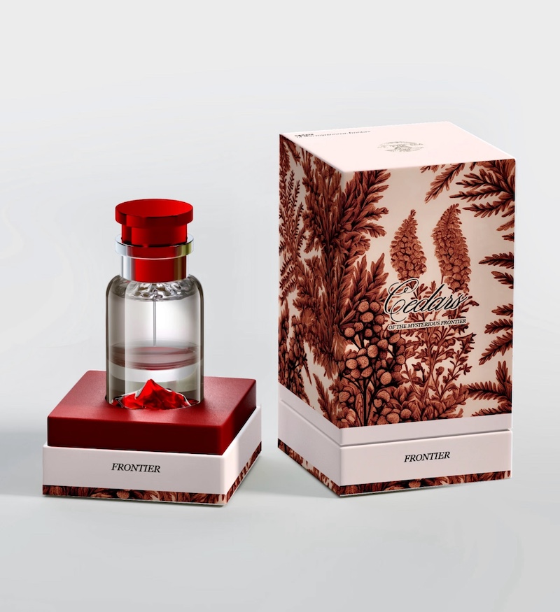
The available packaging options are numerous. There is an enormous variety of colours, sizes, materials and shapes available, from large cardboard boxes to tote bags. An attractive graphic logo will complement these factors well. Consider these options to create a winning combination.
The right colours to use in your packaging logo
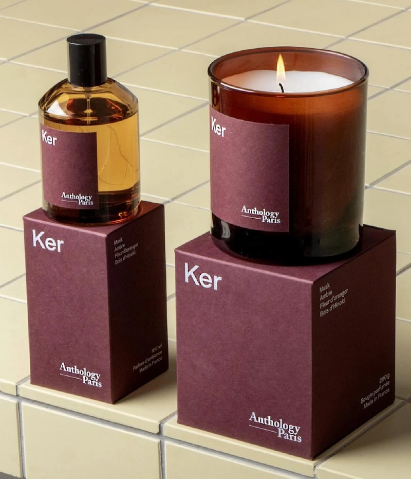
Colours affect us all. They can alter our mood and, in certain instances, even influence our behaviour. This is something that must be considered in logo and packaging design.
Using the right colours can change consumers' perceptions and make your brand associated with certain emotions. For example, red is a colour of passion and urgency, while blue is calm and peaceful. Which is nearer to what you are trying to convey? When selecting your colour palette, consider your brand, personality, target audience and objectives.
Note: Do not overlook the packaging itself, or how the materials, textures, and printing methods used can alter the colours of your logo. Anticipate these differences and make the necessary changes to avoid confusion over the packaging design.
An excellent example of successful colour branding is the Tiffany Blue Box™ of the famous Tiffany & Co. jewellery store. At first glance, you know that it contains something luxurious, thanks to its trademark shade of blue in the logo and packaging design.
Logo Design Tips in Packaging Typography
Have you heard of Comic Sans? The font that everyone hates because of its childish and playful appearance? Such reactions and associations demonstrate how typography can influence the perception of your branded graphic packaging logo.
Take time to determine the personality you want to project and how you want prospective customers to perceive your brand. A childish, colourful company is likely to use a very different font to a traditional, sophisticated company. Choose your typography carefully to create a memorable experience that reflects your brand.
As you do so, consider:
- Readability. Make sure the typeface is legible. The visual effect is amazing; however, if people cannot understand your logo or packaging, they will not engage with it.
- Variety. Use a maximum of three different fonts to create variety. Use one aesthetic element (e.g. the company name) and one functional element (e.g. descriptions and addresses).
- Consider positioning, distance, weight and size. Ask yourself where you are going to use the font, what size it should be and which typography elements you should incorporate to create a unique and consistent brand in your logo graphic on the packaging.
FedEx is renowned for achieving the perfect balance of intelligent typography and logo design for packaging. There is an arrow between the letters indicating the excitement of receiving a delivery. Moreover, the bright colours and space arrangement of this logo package make it even more recognisable.
Adding imagery to logo graphic packaging
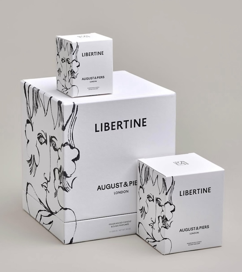
You don't need to read the names of the strongest brands to identify them. An impressive and beautiful image can convey more about your business and the feelings you wish to express. They will also be more effective at catching the eye of spectators and adding oomph to the presentation of your packaging.
You can incorporate a lot of imagery into your graphic packaging logo design, but we suggest keeping it simple. Using a few colours and minimalist shapes can create a transcendent effect.
Dove is a master of image packaging. The minimalist dove is a distinctive and memorable feature. They go the extra mile by making it look like a golden leaf, which is as beautiful and alluring as the brand wants to be. You can recognise the brand even without the wording, which makes it an excellent example of branding.
Ensuring scalability and versatility in a packaging logo
There will be times when you need to carry a large package. Then there are other occasions when you will be distributing hundreds of small samples. This is where scalability and versatility come into play in logo and packaging design. This ensures that your brand remains consistent when printed in different formats, sizes and quantities.
To develop a flexible design, you need clear, unique elements that can be easily changed. These elements must be explainable on both a small and a large scale. In this case, simplicity can facilitate a more comfortable adaptation process.
You should also consider positioning, orientation and spatial arrangements. Will the logo fit on various types of packaging? What are its dimensions? Experiment with these variables to create a harmonious, well-balanced and flexible packaging logo design. This will attract your customers' attention in an appealing way.
Feel free to add or remove elements as you wish. You can customise your logo design to suit specific packaging. Please note that this may be a more expensive option.
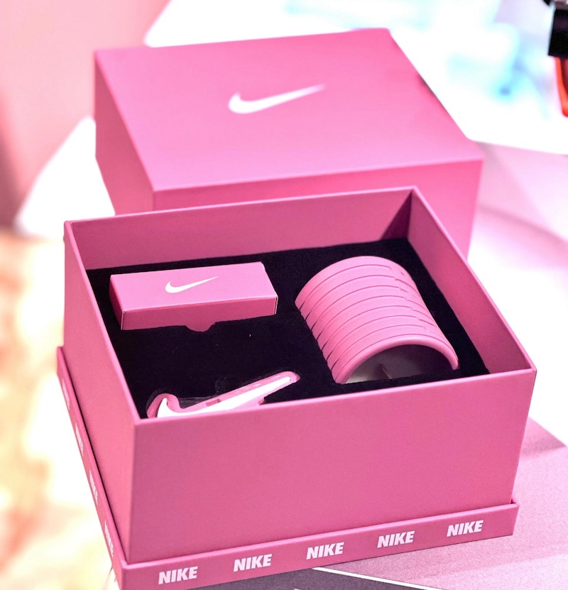
Look to Nike for inspiration on scalability and versatility. They are not afraid to experiment with and modify their logo and branding packages to fit their multiple lines of trainers and requirements. They know that their famous Swoosh is the most important part, so they focus on it without overcomplicating things.
Finding the right balance between simplicity and complexity in a logo graphic for use on packaging is key.
Striking a balance between simplicity and complexity in a logo graphic for use on packaging
Simplicity and complexity are two of the most challenging aspects of logo and packaging design. You should avoid extremes in either direction.
On the one hand, excessive simplicity can result in a generic, uninteresting logo or packaging design. This is exactly what you are trying to avoid. The idea is for the concept to be identifiable at first glance and to establish a positive customer experience.
However, providing excessive sophistication in the logo design is counterproductive. Overcrowding the packaging will create disorganisation and may confuse your audience. It will also make translating your logo into the packaging options of your choice a nightmare.
As mentioned, focus on two key aspects. Write straight, readable lines. Nevertheless, do not lose your brand's identity and personality. Convey your message briefly.
Amazon, the giant company with many businesses, balances this very well. It reduces its logo to the famous arrow/smile when necessary. They also pay attention to placement. When branding packages, they will want to develop an enjoyable composition that places their brand at the centre of their logo.
Testing and testing your packaging logo
The most important piece of advice for successful logo and packaging design is to test, test, test! It's difficult to get it right in a single attempt. To ensure that your logo and packaging design meets your expectations, create samples and prototypes and test them.
Experiment with fonts, colours, positions, scales and complexity. Be deliberate about how these elements are used and how they match each other. You will finally get the right mix.
The best way to do this is to approach your target group and seek their opinion. Once you have collected sufficient data and organised the information, refine and adjust your design to reflect your brand.
With time and effort, you will create the precise version you want to use for all your packaging. Even then, remember to be willing to change your design when appropriate.
Create an award-winning packaging logo!
Packaging and logo design are important but often overlooked factors in marketing. They foster rapport, trust, engagement, brand recognition, stability and positive experiences.
As you will already know, there are many factors that contribute to the development of an effective packaging logo design. Aspects such as colours, typography and versatility might influence the outcome of your work.
Don't miss this chance to elevate your brand and utilise all the tools at your disposal!
Go to Envato Elements to create your ideal logo design for packaging. You will get quality logo templates, artistic digital resources and a plethora of fonts!
Once you have done that, go to Winpack Printing and start turning your vision into reality.


Folding Boxes
How long does it usually take from design confirmation to delivery?
Answer: The delivery time of folding boxes is usually 15-25 days, depending on the production of the order
About Us
What kind of format is available for printing?
CDR, AI, PS , PSD. high resolution JPG (please Convert text to curves. If not, some words will be missing.)
How long does shipping take?
Air freight options range from 7-21 days, while ocean freight options range from 26-71 days. If you need some units expedited earlier, consider splitting your shipment between air and ocean!
OEM Services
How do I get a quote for my OEM order?
To receive a custom quote, simply contact us with your packaging requirements, including:
Product type and dimensions
Material preferences
Design specifications
Order quantity
Any special requests
Our team will assess your needs and provide a competitive quote tailored to your project.
Rigid Lift-off Box
Can I print on the inside of the box?
Yes, you can print any effect you want on the inside.


Start Your Packaging Journey Today
Discover Our Curated Collection of Bespoke Packaging Cases & Tailored System Solutions
© 2025 WINPACK PRINTING. All rights reserved



Wenhua Printing packaging
winpackprinting
Winpack Printing