What Is Color Matching In Printing, And How Does It Work?
Colors are an essential element of your branding and packaging.
However, achieving an exact color match on physical packaging can be difficult for designers.
What you see on screen may differ significantly from the physical product, and even if you are strategic with colors, it can be very stressful when you realize that they simply do not match as they should.
This paper will delve further into the color matching process, the various shades and other reasons that can result in an imperfect color match.
1. What is the color matching process?
The color matching process involves locating and approving on-screen and off-screen colors.
This ensures that the colors you see on screen are correct when the design is printed.
This involves viewing the color, saturation and brightness of the colors on screen to ensure they are representative of what you will see in the final product.
So, how do you actually match colors?
The industry standard for design is to use the Pantone Matching System.
The advantage of this is that the colors are standardized and used worldwide, so there is minimal cause for concern, error or confusion.
Colors can be matched to customer preferences and needs for both digital and screen printing.
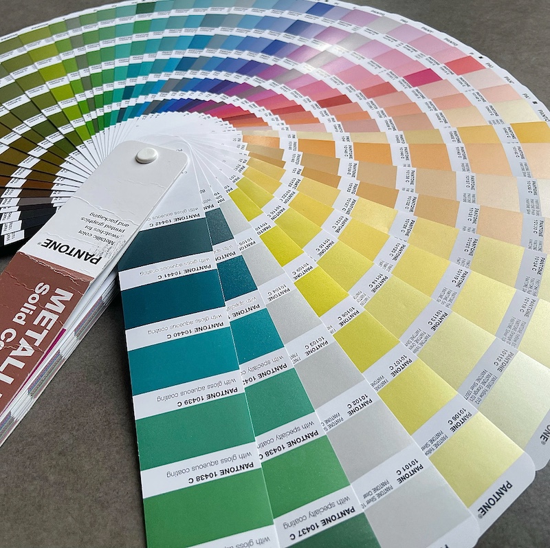
The PMS colors that you observe will then be compared to their computerized equivalent, CMYK.
First, we will take a closer look at the Pantone Color Matching System, then proceed to PMS and CMYK.
The Pantone Colour Matching System (PMS) is a design system used worldwide, developed by Pantone Inc.
Pantone has made its mark in this area thanks to its ability to name virtually every shade of color—they may not have named every shade, but they're still out there!
The variety and richness of the colors offered has made this system popular across the global industry.
Color is known to be very challenging, particularly when it comes to monitors, brightness and settings.
Having a single system like Pantone can reduce confusion and streamline the design process.
It is based on a numbering system that acts as a color code.
Due to its large range of colors and simple standard system, it is applied in design, production, cloth and a host of other uses.
Now, let's explore how CMYK can be utilized in the design process.
Find out more about the Pantone Color Matching System and how to use it effectively!
2. We will also explore the difference between CMYK and PMS
During the design process, you may be asked whether the colors you have supplied are CMYK or PMS.
Designers are used to this question, but business owners seem rather confused, so we have decided to clear things up!
CMYK stands for cyan, magenta, yellow and black. You will find this in your home or office printer and may even have changed the CMYK ink cartridges yourself. PMS stands for Pantone Matching System, as described above.

When printing packaging and logos, you may not think of the same colors as the designers.
For example, you might provide a PMS color that you have selected; however, unless it is specified that it has been selected using the PMS system, designers may attempt to use the CMYK equivalent. The same applies in reverse.
This is why it is essential to clarify this at the beginning, before printing anything!
By indicating the color system in which you have chosen your colors, you can guarantee consistent results.
But what can influence the color matching process?
3. What influences the accuracy of color matching?
Color matching can be influenced by many factors, especially in the absence of a system such as CMYK or PMS.
Screen printing, digital materials and lighting can all affect the ability to achieve a perfect match.
Bright and dark lights can alter how the human eye perceives color, and different screen settings and office lighting can affect how color appears on a computer or phone.
We will now discuss the color matching process in more detail to help you achieve the perfect shade for your packaging!
--The screen
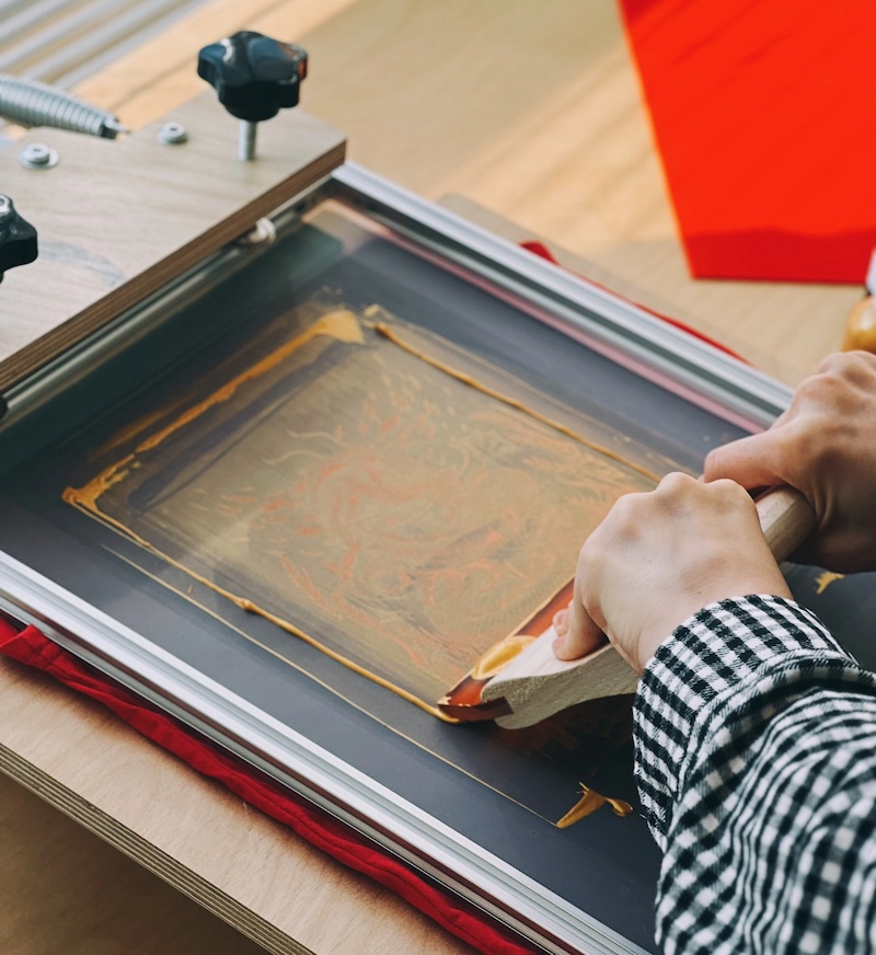
Color matching in processes like screen printing may be influenced by different factors.
The following factors can influence color matching and should therefore be monitored:
- Screen mesh count
- Mesh type
- Squeegee sharpness
- The angle and pressure
- The curing process
However, the advantage of screen printing is that it offers a wider range of colors than digital printing, especially fluorescents, metallics and chrome.
However, CMYK is limited to creating colors using the so-called four-color process comprising cyan, magenta, yellow and black.
This makes it difficult to acquire specific colors, which might not be as bright or intense.
The shade will also differ if you choose coated (i.e. glossy) or uncoated materials.
--The material
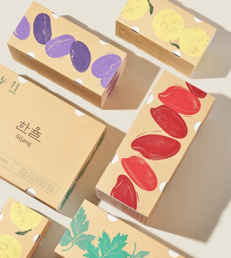
The material you choose to package your product in can alter the color.
Why is this?
Most materials used for graphic overlays and labels are composed of polycarbonate or polyester.
Polycarbonate or polyester.
Your print (and consequently your color) will be either 1^(st) or 2^(nd) surface.
If it is a first surface, it will be printed on the top surface of the substrate and can be read when viewed from above.
With a second surface, the ink is applied to the back of the material. The image will be reflected, and when the sheet is turned, the image will be visible but covered by the material.
When you choose a first surface print, the ink color will only affect the color of the material itself.
You will also need to consider whether an overlaminate needs to be applied to protect the ink or for aesthetic purposes.
For example, applying a matte overlaminate to black ink will make it appear dark grey instead of black.
If you choose to create a second surface print, the material you use will significantly affect the final product.
The effect of matte, textured and glossy materials is noticeable.
If you choose a matte or textured finish, the way light is diffused can make the shade appear darker than a gloss finish.
Even if a material is transparent or clear, it still has a natural color that must be considered during the matching process.
--The Lighting
Another thing to consider when matching colors is lighting.
Color is a quality of light, and we perceive some colors because they are absorbed and others because they are reflected.
This can sometimes mean that the color appears different in different lights (think of the difference in color perception between indoors and outdoors).
Digital printing can also affect the perception of color, as the ink can behave differently in digital printers and reflect light in a way that makes it appear low quality.
Therefore, when matching colors, try holding them in different lighting conditions and focus on the one that you are sure will be most prevalent.
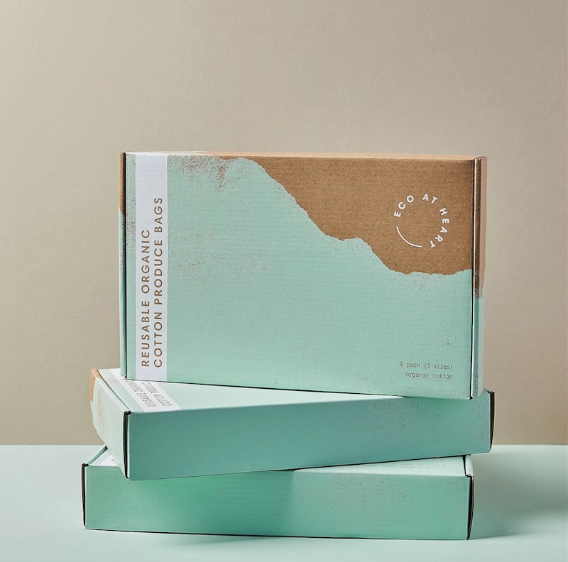
This will help you choose a shade that will be perceived more precisely by others when they receive your packaging, consequently making the unboxing experience more successful.
3. What is the best way to achieve an accurate color match?
Even the most gifted designers will find it challenging to achieve the correct color match.
You will never achieve a perfect match to what you are viewing on your screen. However, it is possible to get very close with the right tools and time.
Do you want to achieve the closest possible color match?
Calibrate your screen
The first step in achieving this is to ensure that your screen is displaying the correct colors.
Remember to check and calibrate your display and printer preferences on your computer.
If you have a Windows computer, you can use this tutorial to calibrate your monitor colors.
For Mac computers, the following guide provides color calibration settings.
Essentially, you will print out blocks of color using your printer's built-in color calibration tool and then compare them to the colors you see on your screen. You can repeat this process until you find a color match that is close enough.
Soft-proofing
As well as printing digital copies of your work and calibrating your printer, you can also use Photoshop to preview the printed appearance and gain an accurate impression of what the printed version will look like.
To access the soft-proofing option in Photoshop, follow this guide.
If you are using a particular printer or paper stock, Photoshop will also enable you to configure these settings, giving you a better idea of what the output will look like.
This is not the only program that enables you to soft-proof, unless you are working on Photoshop for your project.
Also, ensure that you test the soft-proof settings of your desired software to achieve a better color match before printing.
Use a colour library
This is likely to be the most suitable and convenient way of generating precise color outputs.
Although systems such as the Pantone Matching System can be costly, they are certainly worth it when it comes to branding and packaging.
When dealing with a designer, they can show you far more realistic color results using Pantone colors, giving you a better idea of how your branding will appear on various substrates.
4. The Significance of Colour Matching in Packaging
Arguably, the best marketing tool a business can have is packaging.
Branding elements can be used to create an incredible impression when designing your own printed packaging, providing customers with an exceptional experience.
Customers will first see your brand through packaging, so the correct choice of colors and design is important for making a good impression from the outset!
However, bear in mind that ink does not absorb into all materials equally, particularly when it comes to color matching.
The branding of your packaging is very important for color matching. Once you have selected a material, you can begin color matching depending on the substrate and its ink and color acceptability.
The best way to achieve this is to create prototypes of your packaging.
Although they might not be as good in terms of printing quality (assuming you have opted for a digitally printed prototype to save on costs), you will get an idea of what your final product will look like, as well as how your colors will appear on the packaging.
Find out more about the importance of prototyping.
Need further guidance on your bespoke packaging projects? Contact our packaging experts for help with making the right choices for your business!


About Printing Craftsmanship
What are eco-friendly printing options?
Vegetable-based inks instead of petroleum-based inks.
Recycled paper or sustainably sourced materials.
Water-based coatings instead of harmful chemical coatings.
Digital printing to reduce waste and energy consumption.
OEM Services
Can I customize the design, size, and material of my packaging?
Absolutely! Our OEM services allow full customization, including design, size, material, colors, printing effects, and finishing. We work closely with you to create packaging that reflects your brand’s image and market positioning.
About Us
Can you do the design for us?
Yes. We can offer free design the artwork according to your requirement.
What are your lead times?
Production typically takes 12-16 days, and 16-21 days for larger volume orders. Shipping times will depend on the shipping channel you choose.
Rigid Lift-off Box
Can I order a sample of my rigid box?
Yes, we strongly recommend that you do so, we provide a variety of sample types to meet different usage situations and help you guarantee the best results!


Start Your Packaging Journey Today
Discover Our Curated Collection of Bespoke Packaging Cases & Tailored System Solutions
© 2025 WINPACK PRINTING. All rights reserved


Wenhua Printing packaging
winpackprinting
Winpack Printing